Understanding Donut Charts: Creating and Interpreting Data Visualizations
Slides from University about Understanding Donut Charts. The Pdf provides detailed instructions on building donut charts using data visualization software, including practical examples and labeling tips. The Pdf is useful for university students in Computer science who want to learn data visualization.
See more11 Pages

Unlock the full PDF for free
Sign up to get full access to the document and start transforming it with AI.
Preview
Understanding Donut Charts
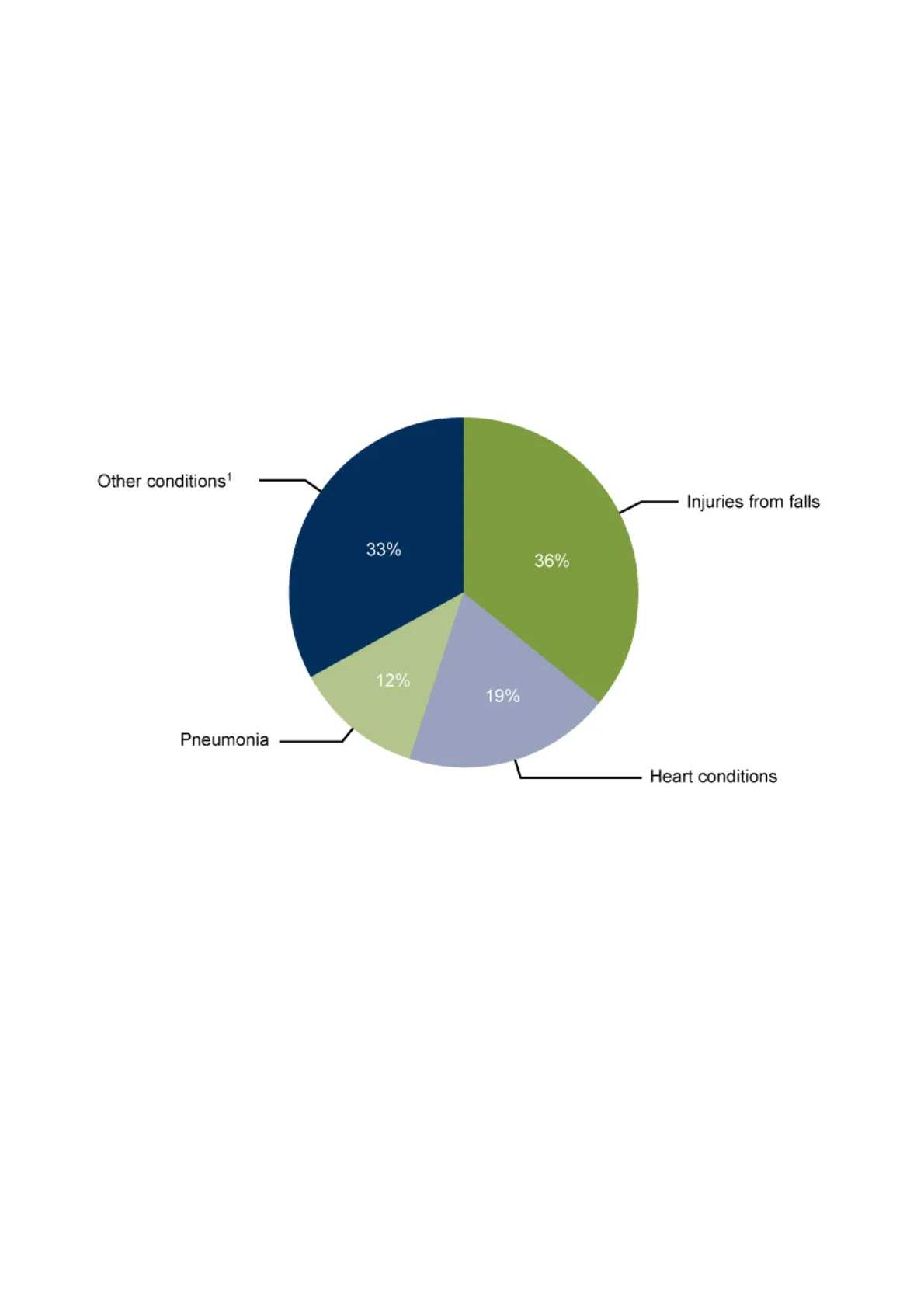
Before diving into donut charts, it's essential to grasp the basics of a simpler version of this visualization - the pie chart. Think of a pie chart as a way to show how different categories or parts make up a whole. As implied by the name, it resembles a pie sliced into different pieces, in which each slice represents a portion of the total. For instance, take a look at the pie chart below, which illustrates the distribution of various conditions as reasons for visits at an urgent care clinic. Since Injuries from falls is the largest slice, it represents the majority of visits.
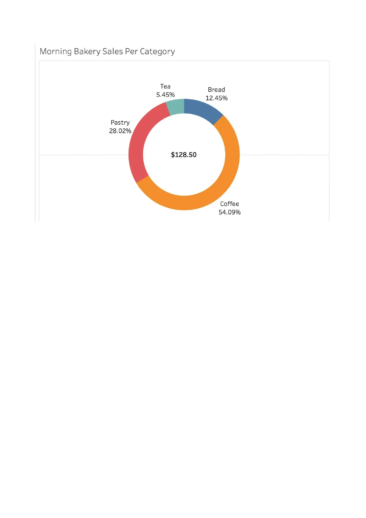
Other conditions1 Injuries from falls 33% 36% 12% 19% Pneumonia Heart conditions Pie charts are effective for displaying the relationship between the parts and the whole, making it easy to compare the distribution of different categories. It's also important to note that you should only use a pie chart if you have less than five categories. Any more than that you will want to use a bar chart. Likewise, a donut chart serves a similar purpose, but it offers an additional layer of insight. A donut chart allows you to compare the relationship between the parts and the whole, as well as feature additional information in the center of the chart. As you can see in the following example, a donut chart is almost identical to a pie chart, but it has the center cut out - similar to a donut. This donut chart shows what percentage of each food/drink category contributes to the total morning sales, with the total sales amount featured in the center of the chart.Morning Bakery Sales Per Category Tea 5.45% Bread 12.45% Pastry 28.02% $128.50 Coffee 54.09% Donut charts are ideal when you want to convey parts-to-whole relationships in your data. Some business applications of donut charts include the following:
- Comparing revenue by categories.
- Breaking down expenses within a budget.
- Highlighting market share.
- Analyzing survey responses.
How to Build a Donut Chart
Imagine you're managing a small bakery that sells a variety of products including bread, coffee, tea, and pastries. To gain insights into your sales patterns, you want to visually represent how your sales are divided among these product categories. In order to achieve this, you'll use a donut chart. This chart will help you see the sales contribution of each product category as well as the total morning sales.
Morning Bakery Sales Per Category Tea 5.45% Bread 12.45% Pastry 28.02% $128.50 Coffee 54.09%You are going to start building your donut chart by creating two dummy fields in the Rows shelf by typing "AVG(0)" two separate times into the "Rows" field in Tableau. The two dummy fields in the Rows shelf act as placeholders to set up the foundation for the donut chart. You should get the results in the GIF below.
89 12 15 2.0.I & Entire View Show Me Data Analytics V Pages ili Columns Sheet1 (Daily Bakery Tra ... = Rows Search Filters Sheet 1 Tables Abc Category Abc Item Sold # Transaction Number Abc Measure Names Automatic T Color Siz Text # Measure Values Detail Tooltip Drop field Drop field here here Drop field here Marks # Unit Price ($) # Sheet1 (Count)Next, you will want to create a pie chart on your first dummy layer to display the distribution of sales across categories. To do this, select the first AGG(AVG(0)) option from the Marks card, and then change the chart type from Automatic to Pie Chart. Then, to populate the chart with your data, drag the Category dimension to the Color card and the Unit Price measure to the Angle card.
Show Me Data Analytics V Pages ili Columns Sheet1 (Daily Bakery Tra ... = Rows AGG(AVG(O)) AGG(AVG(O)) Search Filters Sheet 1 Tables Abc Category Abc Item Sold # Transaction Number Marks Del All til Automatic AVG(0) 0 # Sheet1 (Count) # Measure Values .. T Color Size Label . Detall Tooltip AGG(AVG(O)) Dal AGG(AVG(O)) AVG(0) O Entire View Abc Measure Names # Unit Price ($)Next, you'll want to add your labels so that each slice on your pie chart can be distinguished. We're going to add both the Category dimension and the Unit Price as labels. To add labels to the pie chart, you can drag the Category dimension and Unit Price measure over to the Label card in the Marks card. To make it clearer how each category contributes to the total sales, you can also convert the Unit Price label into a percentage. To do this, click on the dropdown menu located next to the Unit Price label and choose "Quick Table Calculation." Then, select "Percent of Total." Review the GIF below to see the steps in detail.
Search a Filters Sheet 1 Category Tables Bread Abc Category Abc Item Sold Marks Tea Abc Measure Names AI AVG(0) 0 # Sheet1 (Count) # Measure Values Pie .. T Color Size Label 000 Detail Tooltip Angle Category D SUM(Unit Pric .. AVG(0) 0 0 Data Source Sheet 1 Sheet 2 5 marks 2 rows by 1 column SUM of AGG(AVG(O)): 0 Coffee Pastry # Transaction Number # Unit Price ($) AGG(AVG(O)) D AGG(AVG(O))Now your first layer is complete! To transform this pie chart into a donut chart, you'll need to incorporate the second layer. This additional layer will allow you to display the total sales at the center of the donut, enhancing the overall visualization. Select the second AGG(AVG(0)) option from the Marks card, and then change the chart type from Automatic to Circle. Set the color of the circle to white so that once this layer is placed on the pie chart, it will appear as a hole in the center. Finally, drag the Unit Price measure to the Label card so the total sales for the morning are displayed. This will complete your second layer.
Sheet1 (Daily Bakery Tra ... = Rows AGG(AVG(O)) AGG(AVG(O)) Search 8 Filters Sheet 1 Bread Abc Category Abc Item Sold Tea 5.45% Bread 12.45% Tea # Transaction Number Pastry 28.02% All AGG(AVG(O)) AVG(0) 0 # Sheet1 (Count) # Measure Values Pie .. T Color Size Label . D Detail Tooltip Angle .. Category D SUM(Unit Pric .. T Category T SUM(Unit P .. 4 AVG(0) 0 Dal AGG(AVG(O)) Category Tables Coffee Pastry Marks Abc Measure Names # Unit Price ($) Coffee 54.09%Finally, you can combine your layers to make a single powerful visualization. Right-click the second instance of the dummy variable AGG(AVG(0)) in the Rows shelf and select "Dual Axis." Once the two layers are combined, you can adjust your pie chart and circle sizing as you wish.
Sheet1 (Daily Bakery Tra ... = Rows AGG(AVG(O)) AGG(AVG(O)) Search Filters Sheet 1 Bread Abc Category Abc Item Sold Tea 5.45% Bread 12.45% Pastry Marks Tea # Transaction Number Abc Measure Names All AVG(0) O Coffee 54.09% O Circle .. T Color Size Label . 000 Detail Tooltip T SUM(Unit Pric .. AVG(0) O 128.5 Category Tables Coffee Pastry 28.02% AGG(AVG(O)) # Sheet1 (Count) # Measure Values AGG(AVG(O)) # Unit Price ($)Now it's up to you to edit the formatting and design of your visualization. Some formatting options include the following:
- Right-click on each of the axes and uncheck "Show Header."
- Center-align the value in the center of the chart.
- Adjust the center value's format to a currency.
- Change the text size for the labels.
The following is an example of a formatted donut chart:
Morning Bakery Sales Per Category Tea 5.45% Bread 12.45% Pastry 28.02% $128.50 Coffee 54.09%
Donut Chart Design
Donut Chart Dos and Don'ts
DO:
- Keep the number of categories to a minimum: It's important to limit the number of categories in your chart to avoid overwhelming your audience. When a chart contains too many categories, it becomes cluttered and difficult to interpret. You should have less than 5 categories to use a donut chart or pie chart.
Charitable Giving 1.01% Transportation 4.06% Transportation 8.16% Entertainment 6.12% Groceries 16.33% Savings 20.41% Savings 10.14% Gym Membership 1.62% Total Spent: $4,930.00 Total Spent: $2,450.00 Health Insurance 7.10% Home Repairs 2.43% Rent 24.34% Rent 48.98%
- Use distinct colors: Use color coding to highlight key categories and make the chart more visually appealing. Effective color usage can make your chart more engaging and informative.
- Label categories clearly: Label each category clearly to avoid confusion and provide context for readers. Clear and concise labeling is essential for guiding your audience through the chart.
- Provide supporting materials: Provide additional context and explanation, such as data source and date range, to help readers interpret the chart accurately. You can also use a legend or data table to provide more detailed information about the categories if needed. Providing context makes your chart more informative, allowing viewers to understand insights.
DON'T:
- Use 3D effects or exploded slices: 3D effects and exploded slices may seem visually appealing, but they can distort the proportions and readability of your chart. These effects can mislead viewers and make it challenging to accurately compare categories. It is best to have clean, straightforward visualizations so that your data is not compromised.
- Use donut charts for large datasets: When dealing with large or complex datasets with numerous categories or intricate relationships, donut charts may not be the ideal choice, as they are best for representing a small number of categories that are parts of a whole. As with pie charts, you want to avoid showing many slices with many categories. Alternative chart types like bar charts or stacked bar charts may offer better clarity and insight.
- Use donut charts when comparing similar sizes: Donut charts may not effectively communicate subtle differences between categories. When the differences between data are small, it can be challenging to distinguish between segments in a donut chart. When one of your goals is to compare two slices that are very similar in size, bars are better.
- Use donut charts for time-series data: Donut charts are not suitable for displaying changes over time, as they lack the ability to show trends and patterns effectively. Time-series data is better visualized using other chart types specifically designed for temporal data representation.
By following these dos and don'ts, you can design more effective and informative donut charts that accurately convey your data to your audience. It's important to remember that donut charts are like pie charts and have the same issues.
Can’t find what you’re looking for?
Explore more topics in the Algor library or create your own materials with AI.
